Colors
Color Picker
The color picker allows you to select colors to be used with the brush tool or by the selected layer.
Color Button#
You open the color picker either with the color button in the sidebar or via a layer property in the inspector.
The behavior of the color picker that is opened via the sidebar depends on the selected layer and tool.
This color picker generally selects the color for the brush tool, however, when a text or path layer is selected and the transform, text or path tools are selected, the color picker controls the fill and stroke colors of the selected layer instead.
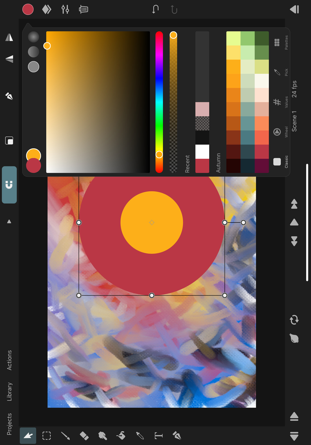
Primary and Secondary Color#
You can see the currently selected primary and secondary colors in the top left corner. Refer to the color dynamics settings to learn about how the brush tool uses the primary and secondary colors.
If the layer color and stroke are being controlled by the color picker, then the stroke is shown in the primary color slot and the fill is shown in the secondary slot below.
You can swipe the primary color cell to the right to quickly swap the primary and secondary colors.
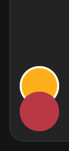
Color Types#
If the color picker is opened in a context in which gradients can be selected, the different color type options are shown in the top right corner.
You can then either choose a single solid color, a linear gradient or a radial gradient.
Tabs#
You can choose different tabs of the color picker at the bottom to switch between different interfaces, depending on how you prefer to select colors.
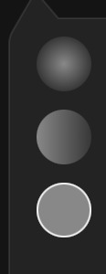
Classic#
The classic color picker interface shows a rectangular saturation-brightness picking area, where the saturation increases horizontally from left to right and the brightness increases from bottom to top. Below this, you will find a simple hue slider.
Wheel#
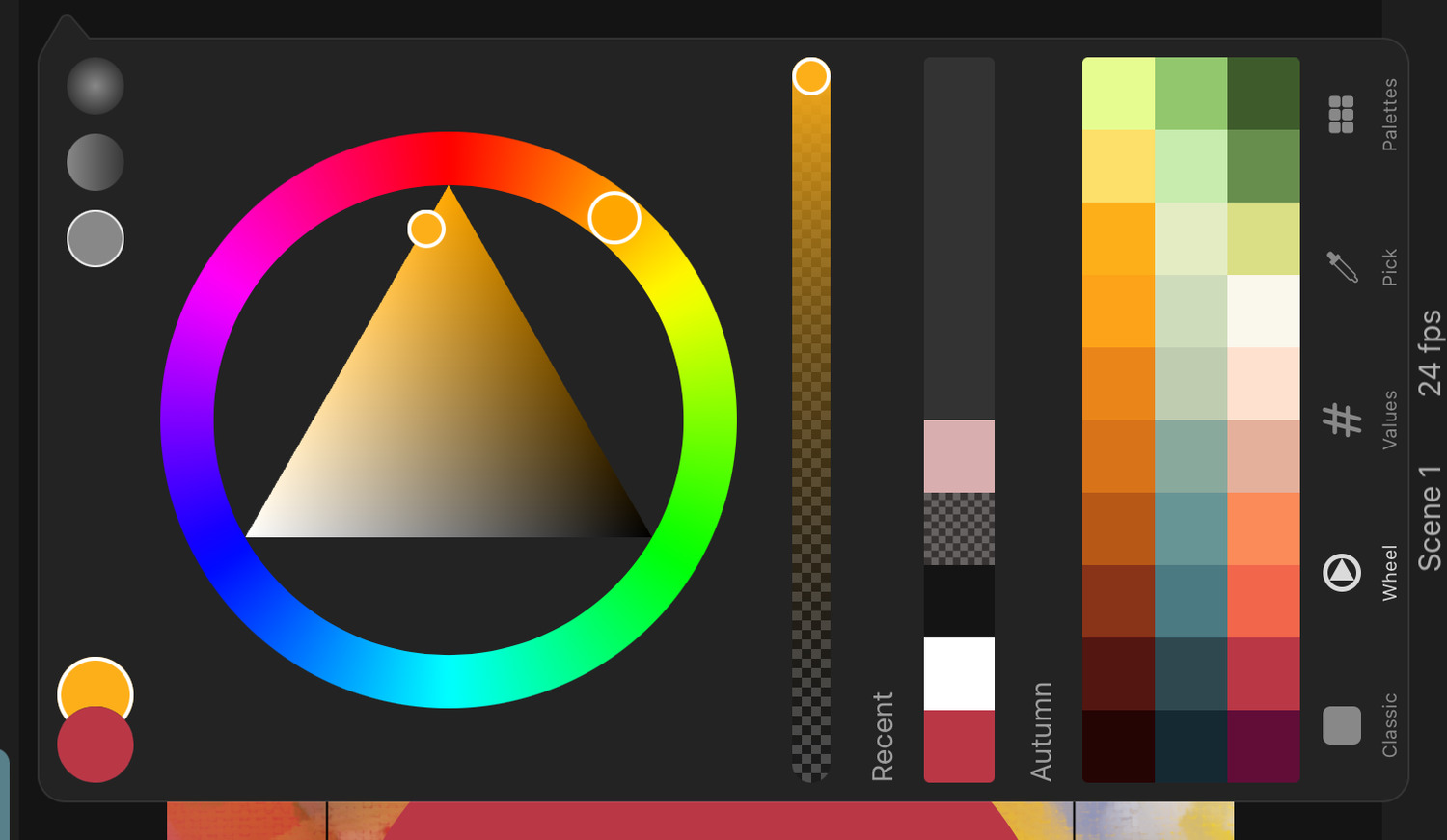
The wheel color picker shows a triangular saturation-brightness picking area. The minimum saturation is at the left edge and the maximum saturation is at the bottom-right edge. The saturation increases with the angle between the two edges.
The lowest brightness (i.e. black) is found at the bottom corner and the highest brightness (i.e. white) at the opposite edge.
This saturation-brightness area is surrounded by a circular hue slider, which makes picking the hue a little easier than it is in the classic color picker.
Values#
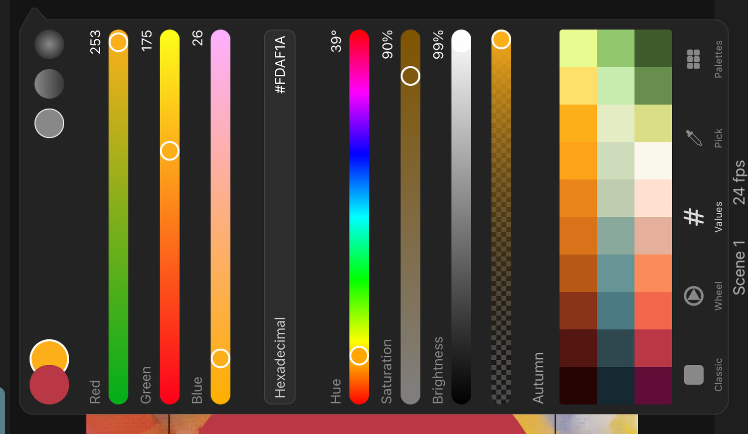
The values tab shows three sliders to input the red, green and blue components, three alternative sliders to select the hue, saturation and brightness of the color and an input field where you can enter the color value in hexadecimal format.
Pick#
This is the only tab button that does not change the color picker interface but instead switches to the pipette tool to pick the color for the color picker from the canvas.
Palettes#
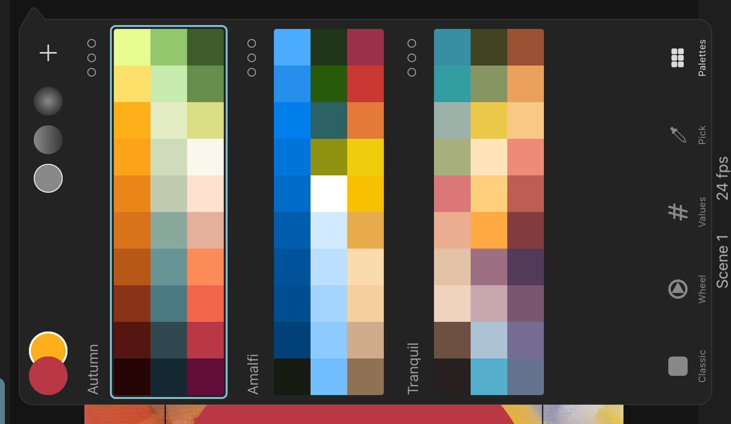
This tab shows the color palette library, where you can add, select and manage your color palettes.
Opacity#
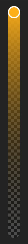
If the color to be selected can have a transparency component, an opacity slider is shown in addition to the controls mentioned above.
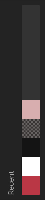
Quick Palettes#
The Classic and Wheel tabs show a list of the 10 most recently selected colors and the selected color palette. The current palette is also shown in the Values tab. You can change which color palette is shown here in the color palette library.
Floating Color Picker#
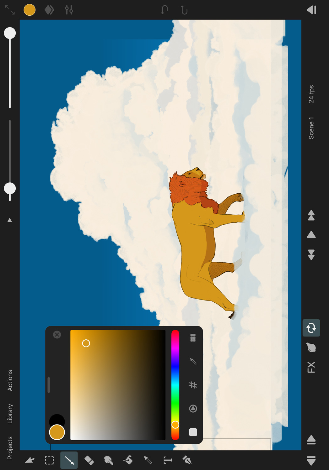
If you drag the handle at the top of the editor's color picker, you can detach it from the sidebar and position a compact version of the color picker anywhere you like on the canvas. This allows you to keep the color picker open while working with the brush tool.
Tap the x button in the top right corner to close the floating color picker.
No search results